Search the Community
Showing results for tags 'Interface'.
-
I just started playing PoE2 and am learning the interface. I wish there were more UI customization options.* Two things I find unnecessary and distracting: the "Fast Mode Active" text and the big, red "No" symbol cursor. I know you can hide UI entirely, but that removes the parts that are helpful also. At least for hiding the "Fast Mode" text I did find this little mod, but it's not a great solution because there's still a big, flashing "F" on screen. I can already tell Fast mode is on because of how fast I'm moving as well as the speed and color on the clock -- the text is overkill. Maybe there's a way to further mod this mod? - *OPTIONS: I understand that some people do want these things.
-
Dears, I guess I'm not only one who find size of dialogues too small. I'm playing on TV and it's really painfull for my eyes to go throught text. May i kindly ask you do Obsidian indicate this problem as problem and when we could expect a patch which increase size of dialog interface and text? Thank you in advance,
-
Something that struck me as odd, but why are there no separate saves for alternate characters? I figured that this was a no brainer, considering this has been the case in Pillars 1, 2 and Tyranny. Hell, even Bethesda RPGs started doing this after Fallout 4. Fairly early into the game, I created a second character, just to try out another build. I didn't get very far into the game, but I never performed a manual save. This meant that when I returned to my primary character's save, the autosaves and quicksaves eventually wiped my second character from the record. Sure, this can be avoided by doing a manual save now and then. However, when it comes to switching to my second character, I now have to scroll through all my saves and check the character name. I also need to ensure that this is the latest save file I have for them. This could be easily resolved by bringing back separate save tabs for different characters. Why wasn't this included by default?
-
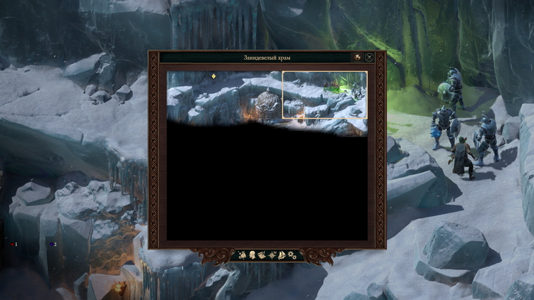
In some locations, the interface of turn-based combat closes characters (creatures are not visible, they are closed by a queue of turns). For example, the location "the Rimebound Temple", battle against rime constructions. See screenshots. I don't see these rime constructs because they are closed by a queue of moves. Please, in turn-based combat - provide the ability to move either the queue panel to any place on the screen, or move the camera to the left and right on the width of this queue.
-
Some interface elements which should be hidden are visible when playing on a widescreen monitor (in this case Samsung 49" CHG90 Gaming Monitor 3840x1080) see attached image edit: appears the ui elements get hidden correctly after combat ends. Thanks for adding a TB mode, having that option is awesome ^^ Just started TB mode, looking forward to seeing the game play out in a new perspective Cheers!
- 1 reply
-
- turn based
- ui
-
(and 3 more)
Tagged with:
-
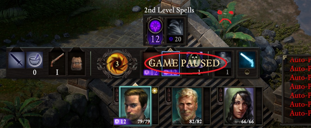
Hi team, I love the layout functionality - however when I have anything but the main game panel in the middle of the screen, part of the interface gets covered by the 'Game Paused' text, which is really irritating when I have the Party & Abilities UI in the middle as part of it is obscured by the text. Is there any way to move the text or have it linked with the main game panel when it moves? I've attached a photo for reference, in case I didn't make sense. Thanks
-
During interactions with the dialogue window when left clicking an option the game registers it twice, sometimes skipping dialogue or choosing an option. This is a constant issue throughout the game and happens sporadically. I'm unable to figure out what exactly is causing the issue. Just in case it's needed my mouse is a Razer Taipan. A minor issue but a quick search of the bug forum and i couldn't find this so I thought I'd post it. similarly I might have accidentally pick pocketed Edér and insulted a God.
-
Very often when party enters a map, load a save, level up modals from weapon proficiency and AI disable on their own. I know that they can disable in certain circumstances (like changing weapon), but those seem to be totally random (especially AI). When the issue occurs it might affect a few characters (for example one will have AI disabled, another modal disabled, another one both of them). It's totally, globally, cosmically annoying....
-
What does this mod do? This mod colorizes Afflictions and Inspirations so that they will be easier to identify and understand. It only works on the tooltips but should make it easier to see what affliction belong to what "category" so that you can buff/debuff your party with a bit moreclarity. You can download the mod here: https://www.nexusmods.com/pillarsofeternity2/mods/32 --- It looks like this in game: Hope you like the mod and if I missed anything please let me know and I'll try to correct it ASAP. --- Please note that this mod only works on the English version of the game
-
Hi, Obsidian. There are some things about interface I found odd and wrong. See the list below please, I hope you will implement at least part of my suggestions within next few patches. 1. I'd like to see the red button meaning "back" in the selling cards menu would work like "back" and not like "cancel". Eventually you want to just go back one step before selling and make some changes to your characters' decks. And you can't - you have to make every change to every deck once more before selling. 2. I'd like to see the possibility to go to the character's info screen from the inventory menu. You can go to the invetory from the cahracter's screen but not vice versa. And you really need it frequently especially when you are new to the game. 3. I'd like to see some lore info for Iconic Characters, for their realms, and for their world. Maybe in a digital art book DLC or something. I'm a bit familiar with charaters and their world but people who see the game first time have to google cahrater's history to better understand him. As for me it's not right to search everthing in the Internet, there has to be some synopsis for every character at least. 4. I'd like to see a comfortable party management from the Campaign menu (where you can see the region's map) for you haven't to go to main menu every time, changing another party, removing\adding a charater from another party, giving them new cards found, etc. Just when your party has passed some campaigns\scenarios and you add a character that didn't make such progress the missions he didn't pass should be marked with some "X" sign saying something like "one or more characters from your current party haven't passed the previous campaign/scenario". 5. I'd like to make it possible lo leave characters without cards (just to make it impossible to go on the mission to the party they are currently in) and to dismiss them understaffed. Or to make it possible to give characters basic cards avaible any time before questing. 6. I'd like to see some buff for Zen Archer. Zen Archer is more like lore-based character but the buff for him is strongly required - now he is like trial version of Harsk It's funny but Sajan is the only "PA" character who has no choice in choosing the speciality - compared to the Zen Archer the Drunken Master is to powerful on both roles (support and attacking). Every other characters are pretty well balanced as for me, at least you really have a choice. 7. I'd like to see the selling price of the cards I've found before I go to the selling menu screen. Maybe it's just a chicane, but it seems to be wrong you can't know the cards' prices. For the new players the price could be a reference point in deck-building before they start to undestand game's mechanics. Cheers!
-
Playing Quest mode, I pulled Skeleton Horde. Kyra's at bat. Kills it with her +2 hammer. She's just unlocked Roles, chosen Exorcist, and picked the ability to heal a random card whenever she kills undead. Options come up on screen: heal or continue. The Skeleton card appears on top of the location deck. Regardless of my choice, the interface freezes - nothing, including the settings button, responds. Have to force stop program to get back to menu, but if I try to continue I wind up right back at the heal-or-continue buttons, with the same behavior. Backed up my save and reinstalled - same action. I REALLY do not want to delete 30 levels of progress across 11 characters in quest mode. HELP.
- 22 replies
-
1) in legendary mode , when looking at the map of scenario and the locations sometimes it can be hard to determine which node leads to a particular location you want to get to. The pink lines are meant to assist in that sense but the way they crisscross when 2 of more location are close together can be confusing. When clicking or tapping the any locations , by simply highlighting corresponding adjacent locations with a rim of color, on top of the pink lines, will make it far better to read. 2) replaying a particular story mode and seeing that long pre scenario CG again? Please enable a skip or fast forward option for players that wish to get to action fast 3) ever picked up that spell or item you used and don't want in your pack again and accidentally press recharge instead of discard? A cancel button at the dice roll screen prior to making the dice roll to return player to the recharge/discard box would be good.
-
Hover over tool-tips are not always displaying. The term is being highlighted but no pop-up shows. It affect all windows. In addition Hover links color on item details changed from solid brown and green to dim gray which is hard to read. Missing buttons: Missing fancy drop-caps for Latin extended in Polish version. i.e letter "Ś" has no drop-cap at all, and letter "Ł" is transparent instead of green.
-
Dear Devs, first of all, I want to say that the game is great and thank you for your efforts to make it even better by patching! But unfortunately it can't be played comfortably using my display native resolution (1920x1200) because of blurry font. Changing resolution to 1920x1080 helps a little, but still font is not 100% crisp. Poor resolution handling is much more game-breaking problem for me than any crashes or stat boosting, beacuse in my case I can't even start a game without getting eyestrain. As far as I know this issue has been reported during beta, but I couldn't find any Devs team post addressing it or confirmation that the problem is recognized and going to be fixed. So is there any chance the blurry text problem gets fixed?
- 4 replies
-
- resolution
- blur
-
(and 1 more)
Tagged with:
-
When you sell common weapons and armor to one merchant, they are shown separately in a long list instead of being stacked, if they are similar to items the merchant already has. After a couple of hours in the game you are forced to scroll hundreds of useless sabres and daggers etc., you've sold earlier, to find something useful to buy. Is it a bug or a feature?
-
Just started the game and what struck me first as a rather large inconvenience was the dialogue representation in the game. PoE apparently chooses to go the way Planescape: Torment did (as opposed to BG series) and along the regular dialogue replicas, it gives you also some fluff information around, describing the general circumstances (i.e. that you interlocutor shrugged or that he is looking at you very strangely or some such). Now I admit I am not a huge fan of this, however I respect this design choice. However I think it is implemented rather poorly. I beleive the fluff text and dialogue text should be distinguished much more than by quotation marks and a very slight degree of brightness. The distinction should be either by different font colour (e.g. white and light blue) or different font type (italics / non-italics). I am aware that e.g. in PsT, there was no such distinction and it did not pose any problems, however first of all this game was much more text heavy and, more importantly - there were comparably much fewer *voiced dialogues*. Now this is where the real problem enters the scene in PoE. On one hand, you have the text dialogue that gives you the dialogue replicas *and* the fluff text of various lengths, on the other, you have the voiced dialogue that gives you the dialogue replicas only. You are forced to follow the text dialogue because it gives you more information in the fluff (some of the fluff descriptions are quite lengthly) but you are disturbed by the voice dialogue that *does not* follow the text you are reading at all and you get desynced very fast: Text - Sound fluff replica replica replica replica replica fluff replica You either need to stop reading the text and just listen to what they say (at least for me it is difficult to read fluff text and try to perceive what the character is saying aloud) or frantically try to find the text the character is saying (can you imagine the experience of people with not that good English?). For the future, I would propose to forgo entirely the fluff text in all voiced dialogues. The information provided by the fluff text should be conveyed in a different way, i.e. combination of the contents of the dialogue and voice acting (or an actual animation if you feel daring), however this is obviously impossible for the existing dialogues, where I would go for a decent colour distinction. This should not be too hard to patch in since most of the speech is already pre-parsed very clearly by quotation marks.
-
I'll try to keep this as brief as possible, and if I seem to go into too much details at times, it is because I have the maybe-too-ambitious goal to help the developers not just with suggestions for a current problem, but to propose them a better general approach to a more abstract problem. Ok, with that said, my main argument is that the problems we are all having with combat right now (v333) are due not to deficiencies in the game mechanics/ruleset, but to deficiencies in the User Interface. PoE is to use a "real time with pause" system for combat1. The main problem with this system is the risk to overload the player with information2, which breaks his Observation-Orientation-Decision-Action loop and prevents him from choosing the optimum set of actions for his current situation. Time pressure isn't an intended feature of the combat mechanics of the game3. Currently this is exactly what happens, the player is overloaded with information when playing out battles in realtime, which practically forces him to use the Slow time feature (press the S button at any time to toggle it on/off), and to pause the game manually at regular intervals and/or to use the autopause options. The problem I see (there may be more) with this playing style being forced onto the player (because of a UI deficiency), is that while it makes combat playable, the player receives only a piecemeal experience of it, and misses out the dynamics and the emotional impact provided by the beautiful graphics and by the sound effects4. I see two main changes that could be made to remedy this problem (with the piecemeal experience of combat), and they are basically pointed at preventing the information overload, thus restoring a functioning OODA loop with a humanly-feasable realtime combat speed. Firstly, I propose that the animation speeds are cut to about half when in combat, how much precisely is a matter of trial and error, with the resulting about x2 increase in action cooldown periods across the board, for all weapons, spells and talents5. Second, the current halos above character heads provide a sort of a meter for the action cooldown of characters (the little horizontal lines), but I'm pretty sure these meters, although identical across characters, don't progress with the same speed for each character. This radically reduces their usability while the player is in paused mode, because he can't get an idea of how fast the lines are shortening for everyone. And if he unpauses in order to get an idea of who will be the next character to initiate action, it often may be too late for him to react. Additionally, trying to visually compare the length of lines is inconvenient, even if they were moving with the same speed. The solution here is simply to provide a form of unambiguous visual feedback of which will be the next character who will be able to take action. This would give us a combat system which we may call "desynchronised turn-based" Off the top of my head, there are three ways in which this may happen. First, make all the cooldown indicators grow shorter with the same amount per second, but increase the on-screen length of the indicators. Then getting a hint of which character's "turn" would come first would be as simple as finding out who has the shortest line. Alternatively, you can make it so that when in paused mode, the section of the cooldown indicator that will shorten will blink. Then when paused, the player will check which of the characters has all his remaining cooldown indicator blinking, and know that this is the character who will next be able to preform an action. The third approach is I think the best - simply have the game make the calculation for the player and write the order somewhere in the halo. I've provided a modified screenshot illustrating that. One problem that always exists with this solution is that if one of the AI characters, or the player suddenly decides to change the action he was about to take when his turn comes, this may require a re-calculation of the whole queue and changing the numbers accordingly, which the player still has to keep an eye out for. A more radical solution to the problem would have been to provide all the information needed by the player, for any hovered character, in the center bottom of the screen instead of in a halo, doing away with the frankly redundant set of buttons there. I may make the argument for such a change in a future post6. Thank you and let me know what you think. ___________ 1 - Personally, I would have preferred a full turn-based system, but I guess it's unrealistic to ask for such a change at this point as this would require reworking much of the combat part of the ruleset, introducing action points in some form, etc. 2 - In Information Theory they would call this "Denial of information through oversaturation of the channel", but I won't go into that here. 3 - After all, the audience's expectations are for an IE games successor, not a Diablo clone 4 - In my opinion this way much of the artists' and designers' work's effect is lost, and this emotional impact is one of the main goals of a game designer - I'm oversimplifying, but you generally prefer people to associate playing your game with tense tactical combat, not with spending 90% of their time in combat in paused mode, sifting through spells and talents and squinting at the action cooldown indicators (the little horizontal lines). 5 - Unrelated to combat, I think the default animation for characters should be walking, not running, as in BG/IWD. Movement speed of the characters on screen should then be slightly adjusted if needed, but I think it's about right as it is. I also join in Sensuki's request that movement animations be desynchronized to prevent the party look like marching soldiers. 6 - I've worked as a QA on software with a halo-based UI though, so I may be biased here, but my impression was that a UI relying on halos has something inherently wrong and providing sufficient information without cluttering the screen is an unwinnable fight.
-
I caught the PC Gamer demo of PoE last night. As a whole the game looks absolutely fantastic. There was one thing, however, that stood out like a nasty chip marring the beauty of a masterfully cut gem: the inconsistent user interface. Now, I’ve been lurking this forum off and on since the Kickstarter campaign and I’ve seen many skirmishes of the skeuomorphic-minimalist UI holy war flare up and that is not the point of this post. Regardless of which side of that philosophic divide you fall I would assume you would desire a consistent interface. During the video I counted what I consider to be five different “interface styles” (for lack of better term), not counting character creation, etc. The first is the docked dialogue interface. It utilizes a heavy wooden style and is “docked” awkwardly to the bottom of the screen. It doesn’t feel like part of the game; it isn’t grounded in the interface pane like the Infinity Engine games’ dialogue boxes. The second is the floating inventory/trading screen. The third is the main combat screen. This interface appears to be striving for a minimalist approach with free floating panels and buttons. This runs counter to the other screens’ big heavy wooden windows. While I can see some wood in the buttons this screen looks closer to Neverwinter Nights wireframe style interface. The fourth “style” that I saw was the full screen, stone and paper based role playing screens. The fifth “style” that I noticed was the floating wooden looting window that pops up near the item you’re looting. I understand that Obsidian probably chose to do this to minimize mouse movement but given the dynamic positioning of this box from moment to moment it becomes inconsistent in and of itself. Each individual UI element looks well enough by itself but when they are all mixed together the game loses its visual identity. For example, everything in Baldur’s Gate was based in gray stone, Baldur’s Gate II had that light wood or leather (not sure what it was), Neverwinter had that gold wireframe. I did not get that sense of consistency from the PC Gamer Demo; wooden skuemorhpic buttons here, full screen stone there, metal filigree surrounding floating box down there, etc… I am not going to argue for or against whether or not the interface should be minimalist in nature so we can better see the paper dolls on the grid. But I would like to see a more consistent visual identity for the game especially since I am very optimistic for future sequels in which I hope they would also have their own unique designs.
-
I request that [continue] choices in dialogues (i.e. when there are no 1, 2, 3 choices) be hotkeyed by pressing 1 rather than enter, or some other key closer to the horizontal numericals. Using 1-2-3-4 etc in dialogue feels like smooth sailing. But then all of a sudden there's that [continue]-dialogue and you must either move your mouse and click the button, or move your hand all the way across the keyboard to press enter.