


Grotesque
-
Posts
275 -
Joined
-
Last visited
Content Type
Profiles
Forums
Blogs
Posts posted by Grotesque
-
-
it's better to make some box art that is intriguing and use the concept of souls channeled by some adra pillars than dumping an old ass wallpaper depicting warriors attacked by zombies, like advertising a plastic sword toy

Gone are the days of gamebox cover flaps where you could dump all the visual goodies there for marketing and help keep the box art classy.

-
 1
1
-
-
new weapon sets slots layout & design


Each slot represents one set.
The set on slot II is the one currently in use.
-
7
-
-
the fun starts at 5:45
Illusion: "Veritas, Credo, Oculos" = "The truth, I believe, with my eyes"
Alteration: "Praeses, Alia, Fero" = "Protecting, another, I bring this forth"
-
3
-
-
I think you're being a little critical mate. I'd rather they work on the actual game than design new box art.
Barbie's seal of approval on you train of thought and design choice
-
1
-
-
Found it.
The nightmare is over.
-
1
-
-
Is this all Obsidian managed to pull off in regards of designing proper box cover art for this game? Rehashing an old and obsolete (it even has Cadegund etc) wallpaper instead of bringing something new to the table? Even the manual has a more appropriate simple and elegant design than this!
Please tell me that the Collector's Edition will not even remotely have something similar as box art design.
And all those pink/fuchsia shades...
Somebody wake me up!
-
3
-
-
While I don't have a problem with the current chant book, I have to say the scroll mock-up looks aesthetically pleasing.
And this scroll mock-up could be improved further.
Maybe something like this ( because is not too complex) will be implemented in the final game.
The challenge in this mockup was that between UI transitions, some common elements (character portrait circle, ? and X buttons, etc ) staying the same size and in the same place.
-
"select all "
should be
ctrl+A
no doubt about it
also they should implement selecting adiacent party characters with shift+left click
-
4
-
-
So after a long discussion that escalated way to quickly here some constructive critique

1. The combat log and the portraits seem to end at a random height.
2. Combat Log in the middle would give it a more balanced feel.
3. Why are the menu buttons all over the place, it forces the player to memorize 3 different areas where he has to look for the menu buttons.
4. Are the formation buttons really that important to give it so much screen space?
5. What about putting all menu buttons on the left side, using rectangular boxes?
1. Bringing the portraits to the same height as the log would shrink them too much.
Also, the log is a bit depressed so that the conversation and fight log tabs would not pop out and intrude the view area. also it gives a nice effect of variation by breaking the line and giving a larger view area on the vertical axis in the center of the screen where it counts most. And considering the log's height is to be player customed, you can bring it at any height you want, pixel by pixel.
2. Combat log is in the middle of the screen (vertical axis). You perceive it otherwise because of an optical illusion. Seeing the mockup in its native resolution and full screen would eliminate that.
3. The UI is practically littered with buttons (spell levels, active chants, weapons slots and quick items are buttons too). And the interface is not designed to the lowest player common denominator (which in this case would be not being able to memorize 2 simple buttons in 5 minutes.)
Also Baldur's Gate did it the same, which can be viewed as a mini-tribute. Replacing the buttons would only leave the area empty and unbalanced and clutter other areas because...
4. The formation buttons are important (at least to me and maybe others.)
Besides several formations being ONE click ready & "pressable" (not an actual word), it helps by filling the otherwise empty space on the left section.
And because this is a symmetrical design on the vertical axis ( and forever will be so on 16:9 monitor proportions), the width of the left section is dictated by the width of the right section which houses those big portraits that me and nearly all love (as it seems).
5. Putting all the main buttons to the left side would only clutter it and leave other areas empty and unbalanced ,such as the case of removing the buttons above sets and quick items slots. Those buttons help to visually balance the spell levels, active chants and grimoire/chanter's scroll icons of the opposed side of the vertical axis.
-
2
-
-
"liking things now that are part of the past is the definition of beeing nostalgic."
sorry, but this is the most idiotic thing I've seen today
coming to a movie theatre near you!
-
2
-
-
Update: wider combat log and view area. 1920x1080
This is the most refined version of this mock-up to date. Small changes to weapon sets layout for the future.


If even now you are not satisfied with the wider view angle, nothing will.
-
12
-
-
The only thing I don't like in your mockups, is the left bar. It doesn't really seem to pull its weight in terms of usefulness, considering the amount of viewport space it obscures
In the mockup for wide monitors, I don't think the left side obscures too much of the view (and zooming a little bit out negates the problem even).
I think that you don't even need a wide view gameplay wise, considering you have shroud and fog of war, so my response is that the wide view is excessive instead.
The left side also visually balances the entire UI (the secret of beauty is simmetry)
Also I will never support a main UI design that is missing buttons to other areas of the player-game interface (map, inventory, etc)
As for the formation buttons, why not have them?
The main purpose of this UI besides immersion and flavor was "why I have to click twice when I can click once?"
Also having 8 formations at the ready accommodates more playstyles. Maybe players that play on hardcore or hard difficulty change formations every 30 seconds.
Thank you all of you for the appreciation.
It was a lot of work considering it was the first I touched Photoshop.
edit: the 4:3 UI mockup, for me has the strongest vibe because it reduces the viewable area to a square like in the old BG
-
6
-
-
combat log is for checking it from time to time in special circumstances.
pause game ---> increase log size----> read log------> collapse log------> unpause game
-
3
-
-
Would someone post a link(s) to a screenshot made at 2560x1440 resolution fo the next mockup?
The more screenshots, the better
-

1440x1080 (4:3)


-
13
-
-
btw: You might want to update the OP with some more recent pictures.
But I can't edit the original post
-
making this mockup was harder than I thought
-


I've made a mockup for the "edit chants" U.I. that looks like a scroll (same as the icon) and not like a grimoire/book.
I also had to change the layout of the grimoire so that the transition between the interfaces of grimoire and chanter's scroll would be visually smooth when changing characters from this location.
http://cdn.makeagif.com/media/2-13-2015/CyD7_j.gif <--- here is a GIF with the transition process
-
4
-
-
Okay. Then we need to mod it in. Or else all of these mockups would have been in vain

In vain? Pillars of Eternity 2?
-
Looks cool! The next challenge and suggestion would do a mockup at 1280x720 and 2560x1440 to see what it looks at low/high resolution. (We also do a 4:3 low res, but I forget the dimensions Kaz uses.) You might encounter some interesting problems.
We won't be doing anything this substantial for our solid UI. It could be a couple of weeks of programming to implement this.
Thanks for sharing!
I'll do a 4:3 monitor mockup and rearrange all the elements at 1440x1080 resolution
-

Small changes to the layout. Money counter, cancel and select all buttons new positioning, more effects added to chants selection buttons.

I like the money counter next to the Inventory button and the select all button under the portraits but the new position of the cancel button does not feel right. What would be best is a new button on the left side. Any ideas?
Now I am working on a mock-up for an "Edit chants" scroll and a smooth transition to the grimoire when selecting next character from the chanter's "Edit chants" UI.
-
9
-
-

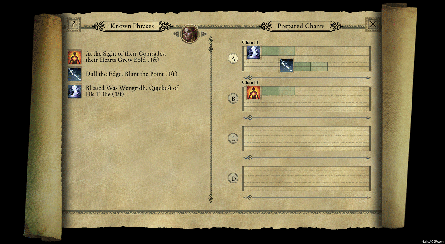
The spell/ability UI section depending on selected class: Fighter, WIzard and Chanter
The dark blue gems depict the number of prepared chants (3/4 in this case) with the second prepared chant being the active one.
Three invocations of level one are available for casting in this case
-
9
-
-
I still don't see a mouse (I'm blind)?
When pressing Print Screen key, the mouse is not captured.
Anybody knows how can I remedy this?
-

I just realized when making screenshots, the mouse does not appear in the final picture.
I had this feeling that something is missing
-
4
-


My old school solid UI mock-up for Pillars of Eternity
in Backer Beta Discussion
Posted · Edited by Grotesque
one reason
https://www.youtube.com/watch?v=lF4pmJTX39E#t=48
where possible, one click anything